listOn this page
What is a Donation Landing Page?
A donation landing page is a web page that is designed to persuade visitors to donate to a specific cause or organization. A fundraising landing page is different from a general website or a blog because it has a clear and singular goal: to get people to donate.
Why Should Nonprofits Have Donation Landing Pages?
Nonprofits need the best donation landing pages because they help people take action. These pages are simple and focused. There’s no clutter, just a clear reason to give and an easy way to do it. When the message is strong and the form is short, more people are likely to donate.
They also let you write your fundraising story effectively. You can explain why the cause matters, how donations will help, and who benefits. It builds trust and connection. And when people feel that connection, they’re more willing to give.
As of Q4 2024, the average landing page conversion rate across all industries is around 6.6%, according to Unbounce—all the more reason to focus on creating a high-performing donation page that drives results.
How Do I Create a Donation Landing Page?
Here are some donation landing page best practices to follow:
Start with a Clear Headline
In a single powerful sentence, your headline should convey the cause. Make it emotional, urgent, or inspiring to grab attention. A good headline directs your focus for the entire page.
Use a Strong Visual
A meaningful photo or short video in your charity donation page can instantly connect people to your cause. Pick pictures that convey actual impact or emotion. The perfect image can communicate more than words, while its message remains unforgettable. To make this even more effective, modern fundraisers can rely on advanced website design to ensure visuals are not only emotionally engaging but also optimized for user experience, responsiveness, and conversion performance.
Tell a Short, Compelling Story
Share what the problem is, why it matters, and how donations can help. Be brief, but be heartfelt. People give when they care. Add real names, real situations, or real emotions.
Include a Simple, Easy-to-Fill Donation Form
Only ask for essential info: name, amount, and payment details. A quick and easy form means fewer drop-offs. The easier it is to donate, the more likely people are to complete the donation. Check out the best practices for a perfect donation form.
Offer Suggested Donation Amounts
One of the most effective fundraising landing page examples uses preset donation amounts to simplify decision-making. By offering quick options such as €10, €25, or €50, you remove hesitation and make giving feel effortless. These preset buttons serve as visual and psychological cues that encourage visitors to take immediate action.
Make It Mobile-Friendly
Many visitors will be on their phones. Make sure your site loads quickly, is visually appealing, and functions well on all screen sizes. A bad mobile experience can cause potential donors to flee. Website developers play a key role in ensuring responsive design, performance optimization, and smooth mobile functionality across different devices.
Add a Call-to-Action (CTA) Button
Use an obvious CTA like “Donate Now” or “Help Today.” Make them big and bold, and visible without scrolling too far. Your CTA should be noticeable and feel urgent, but not pushy.
Check out our blog for 100+ Donation Call-To-Action Examples to use in your landing page for donations.
Build Trust with Social Proof
Add testimonials, donor names, or stats such as “More than 1,000 donors gave last month.” This reassures new visitors. People are much more likely to be generous when they see others already are.
Say Thank You After the Donation
Send your donors to a thank-you page or display a thank-you letter for donors. It’s polite, and it makes people feel valued. A warm thank-you creates goodwill and generates gifts in the future.
Track and Improve
Leverage tools like Google Analytics to determine what’s working. Experiment with alternative headlines or images and refine them based on the data. The optimization process is ongoing — small tweaks can make a big difference.
Try Setting Up a Donation Landing Page that Actually Works!
Above-the-Fold Optimization for Donation Landing Pages
Above-the-fold is the content a visitor sees before they scroll. It’s important because it frames first impressions and determines whether users will stay or leave. For donation landing pages, this area should tell your story, contain an irresistible header, have a powerful visual, and display a prominent “Donate” button.
Keep the visuals clean and to the point. Avoid clutter or distractions. Triggering emotions with short messages can ensure a fast-based engagement. By optimizing this section, visitors are immediately oriented about your mission and prompted to take action, increasing engagement and conversion rates right away.
Donation Form vs. Donation Landing Page: Key Differences Explained
Feature | Donation Form | Donation Landing Page |
Purpose | To collect donation details quickly | To persuade, inform, and collect donations |
Content Depth | Minimal – usually just form fields | Rich content – includes story, visuals, CTA, and the form |
Placement | Often embedded on a website or a sidebar | Standalone page with no distractions |
Design Focus | Functional and straightforward | Visually engaging and emotionally driven |
Conversion Goal | Complete a transaction | Convince and convert visitors into donors |
Use Case | Ideal for recurring donors or fast donations | Ideal for new donors or campaign-specific fundraising |
SEO & Sharing Potential | Limited – not usually shared or ranked in search | Optimized for search and social media sharing |
Storytelling Elements | Usually none | Includes cause description, emotional appeal, and impact |
Call-to-Action | Basic (“Submit” or “Donate”) | Strong and clear CTA like “Help Now” or “Make a Difference” |
Customization Level | Limited layout or branding options | Highly customizable for different campaigns and goals |
Ideal Fundraising Landing Page Examples
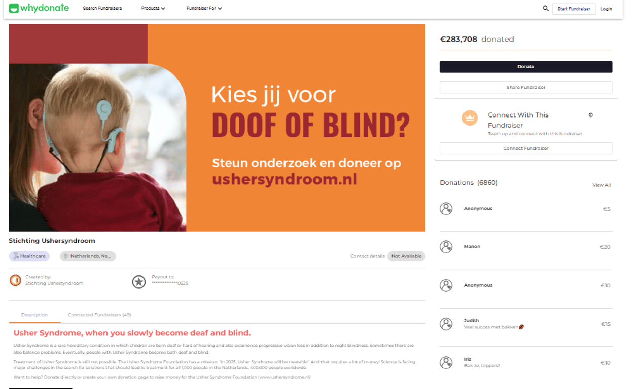
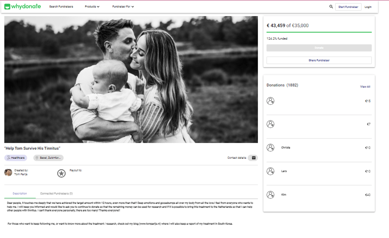
An analysis of successful fundraising landing pages can motivate you to create your own. A health charity might rely on a moving story and a sharp image, alongside a visible donate button, while an environmental nonprofit might focus on an impact video and a goal progress bar. By seeing what works, others can learn, helping to drive engagement and donations.
Here are 2 donation landing page examples for you to have an idea of what a successful donation landing pages look like –
Get Started With Your Donation Landing Page Design
A well-designed donation landing page can help you supercharge your crowdfunding success by gaining more donors and making more of an impact. Getting it right takes planning, testing, and fine-tuning — but the payoff is worth it.
Try WhyDonate’s free donation landing page builder. Create Your Donation Page Now!

Sudatta is a senior content manager with more than 10 years of experience in the content space and an expert in crowdfunding and fundraising-related topics. She enjoys creating engaging and reader-friendly content. In addition to writing, Sudatta is also passionate about music, travelling, and reading.